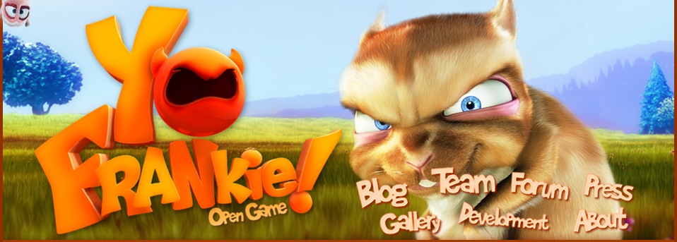
(note the 2 (!) exclamation marks in the title, i’m excited)
yay! I hated that green background 😀
The other day, talking with Chris about ApriStuffs, we agreed that the old theme wasn’t the better, at this moment we all know that its gonna be a Frankie’s game, so.. why we have 3 rodents in the banner? lets give Frankie what he deserves! a big and *rendered* header 🙂
Was all made in The GIMP, Inkscape and Blender, was just playing around with the old logo in Inkscape, then imported the .svg in Blender as curves, added a material, rendered, and composited.
I’ll be making a splash for our brand new and shiny ApriBranch! we have our own branch! like the one that the Orange project had years ago, we will be adding and testing lots of features we need in this project, before going to trunk.
That’s all for now, hope you like the new theme, is not a big change but i just don’t like white-eye-killing backgrounds.
If you find a bug or something weird just drop a comment please.


