Yo!, we got a name: Yo Frankie!: A Furry Vendetta
People voted for this names (ain’t open source beautiful? =), and we sorted them out like: Yo Frankie! the main name, and “A Furry Vendetta” as the name of this episode, now is your time to start thinking/making the next episodes 🙂 Yo Frankie: “Point Blank Frank”, or “The Rise Of Frank” are the most voted, pick which one is going to be the name of your own level (s)! 😀
You can download our new logo in all this flavours:
Big 3DLogo, with background – 1440x810px
Big 3D Logo, no background (alpha) – 887x670px
2D Yo Frankie! Logo – Small Size / Bully Size
2D Yo Frankie! Text – Small Size / Bully Size
2D Frankie Icon – Small Size / Bully Size
.zip file with all this (~2.2mb).
Peace.

Hey re-lindo bolú
Nice logo man 😀 will paint it on the skate board.
cool looking logo.. now that I see the name like that.. I like it more 😉
YEAH! I voted for tht one! Nie logo!
Do you remember “Yo Noid”?
Good 3D lighting and colors logo! That looks VenomGFX style!!! 😉
Now I’m really curious how to do that style. Looks like ramps colors + vertex painting + good lighting + aao + no specular lights + composite or V. sequencer glow effect + composite color corrections and/or gimp retouch … (or not! ;] )
Será más fácil se lo hace un pequeño tutorial! 😉
Cheers!!!
hey pablito! me gusto el logo! la version 3d esta genial felicitaciones!!
omg…
a great project and a worse name
Really good looking logo name :D! And really nice work guys!
Haha! VenomGFX styled text, colors and lighting. 😀
I wonder who made this logo. (lol.. pretty obvious)
Haha Nice Style and very funny! 😀
Where’s Frankie’s skateboard?
just push “SHEEP”! (##spoil!## : ) Nice work!
Yeah the Logo is Fresh! Are any of you guys at E3 or going to be doing coverage of happenings at E3?
I wish I could Go but have to work.
He looks like Beaste from FreeBSD 🙂
Great work, Love the Lettering. Is that a (CC) font or something or was that Lettered by hand?
When I say by hand I don’t mean just draying it and scanning.
Anyhow, At least one of us from the blender Underground is eagerly looking forward to this games release. Should be very soon at this stage.
take care guys.
~Ninja Out
I don’t understand this title. What does this game have in terms of “Hip Hop” or “Yo Nigguh”-culture that justifies such a title? Where is the connection? I don’t think that “Yo Frankie” is a very fitting title for a squirrel-running-through-the-forest game.
@Alex – ur lost right now aren’t you?
-.-
Great title guys!! I voted for Yo Frankie!! Sweet logo!
I agree… “apricot” was fresh, something related to BBB (like FFF titles) whas to expect …. but heh! … democracy has ruled … (hum .. or it is demagogy ? ;p I prefer anarchy hehe… ). At least it’s an “easy” name that will be remembered by fans. typo is great for this tooo 🙂 (when will this DVD arrive again ? :p )
Very cool logo!
That looks indeed very VenomGFX style!!!
Fan for life 🙂
hey
what don’t you give it eyes ?
it’s strange
Reminds me too much of the FreeBSD logo… the text/name is ok.. but not very sure about the logo…
Where would we find the blend file for the 3d version? 😀
Cheers!
(logo is strange without eyes… weird / rather not appealing)
What font did you use to write Yo Frank!?
@Alexander Ewering: Well, he does have a gang forged only for the purpose of intimidating and harassing people.
It looks like Inkscape work to me
Looks like the FreeBSD logo.
Hmm, the name of this episode…
So I hope this means that it is the foundations intention to have more levels and/or episodes created. Maybe when there’s enough, you could repackage it as a full game with lots of levels and call it The Chronicles of Frank or The Frank Saga!
Oh and Alexander, I guess Rocky was into Hip Hop. YO ADRIAN!
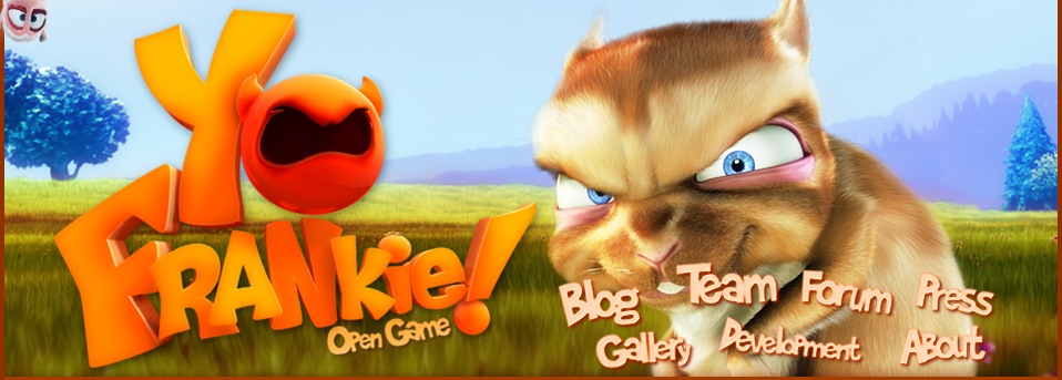
LOL the new header! Is it the only change for the new website you’re supposed to work on or you’re still developing a new layout?
Okay so Ton won. :)Hehe
Nice Frankie-vs sheep image in the header! 😀 (## spoiler! 😛 ##)
🙂
Super ApriAnswer!
@ mangojambo, hey! thanks 🙂 , the logo yes is a mix of all kind of stuff, no vertexpaint, and SSS! that’s why in some parts the text is orange and other parts is more yellowish, also AAO, ramps, specular lights yes 🙂 (the specular is controlled by a blend texture in affecting only the borders, as you can see in some parts the bright edges). Will release the .blend of course, maybe a tutorial? is not game related enough.. but if you want.
@ Alexander Ewering, men you take things seriously!, is just a game name!, and is also easy to remember, short name, 2 words, even in Spanish it means “I Frankie”, i don’t even want to think in a translation for something Furry Funny Frankie or so.
The pose in the header and the way I wrote the post (Yo!, peace..) is just for fun, you should relax and take things easy 🙂 is a game!
@ NinjaBuntu, the font is hand-made in Blender, with curves. Ton also thought I made it with Inskape, why would I? Blender’s bezier curves are awesome.
@ Olm-Z, well i think that some FFF title would be more difficult to remember, less easy as Yo Frankie! is, but that’s just me, people voted for it.
@ Lucas, is a hand-made font made with Blender’s bezier curves.
@ Brian Treacy, ^
@ Justin Operable, don’t know about foundation but at least that was what i thought when writing the post :D, also we are thinking in calling the BGE game “A Furry Vendetta”, and the CS game with some other, so people can recognize them easier.
I would love to see more episodes of Yo Frankie!, really, at least small ones, ours isn’t that big either.
@ jao, not at all!, that’s only a new header just for fun, and for letting people know about this new title we are choosing, the brand new shiny website is scheduled for the last couple of weeks of august, to make it look similar to the one that will be in the DVD.
About FreeBSD, didn’t know this logo, googling a little bit found that is from 2005?, last time I used FreeBSD was 2003 i think, anyway, is not an unique logo at all, I was aware of that when making it, I tried to put more emphasis in the eyes, since a ball with horns is pretty common (like FreeBSD one), try searching for “devil ball” (tried this one before writing this comment and yes, there is a lot!), maybe smarter searchs can give even more results.
Wow. That is awesome! I like the new site! Especially the new picture of Frankie. It is a little weird that it is not the Apricot Open Game but Yo Frankie Open Game, nevertheless Nice Work!
(spoiler) hahahah
WHUUUAAAOOO.. That logo screams venomfx. How does he *do* that. It looks kinda fuzzy, but glossy. It’s the ramps. The ramps are *freaking me out!*
are there stickers? 😀
This could be very interesting.
So if they made frankie all, you know, urban.. would that be awesome or horrible?
…I really don’t know, heh.
frankie can have his own brand of games
am I the only one who saw the splash-screen under the hidden link on this website? watch out for sheeps! 😉
btw tweaked a little bit the site to highlight the comments made by members of the team, should be made before but now is more needed with so many comments in each post 🙂
Wow Venomgfx, you hand made them and even fooled Ton?! That is AWESOME!
I think the logo idea should be revamped.
Perhaps a metallic apricot fruit will be more suited for this?
Hey Marty. I think we are the only ones who has seen it. XD
Why is the apricot crying?
Yo
I also voted for that name,nice and styliey logo
I like the logo, it looks nice 😉
The ‘i’ and ‘e’ are well dodgy.
And having eyes for the bowl of the ‘o’ is rather lame and simply doesn’t work.
Blengine has said…
“the game is a bullying game where the final objective is to run down the rabbit.”
And if the game is gonna be called ‘Yo Frankie!’ with a vendetta subtitle then you may as well go all the way with a mafia gang theme…
Give him a New York Italian accent.
Have some characters that act as woodland Cops/FBI/CIA that Frankie has to evade.
Give Frankie a boss like a Godfather character who he has to keep happy or he will get ‘whacked’.
etc, etc, etc.
I personally think that
Yo Frankie: Going Nuts
would be a good saga name
Yeah… ‘Frankie Goes Nuts’ would have been a good title for the first game set in a woodland/forest. Then a sequel could be set in a jungle and call it ‘Frankie Goes Bananas’.
Will this game be available for PSP..Should sony approve it …
Really awesome logo! I like it like 100 times better now! Good job!
@Alexander Ewering:
In the BBB world where life is about chasing butterflies and sniffing flowers and such, the rodents are the “Hip-hop” characters. The name couldn’t be more suitable when in tandem with any of the game graphics.
It looks great!
I’d love to see the blend file. I know you said you’ll share it but I can’t find it anywhere. Did you posted it somewhere?
Such a bad name for such a great project… pity
Hey, you can use this for the theme song…
FRANKIE
I don’t think it would be too cheesy, considering the bloody awful name the game has been given.
Wow ! Great ! I’ve tried to rebuild effects used in the shader of the text but I’ve not reached this result. Very impressive. I’m waiting the tutorial…
Congrats !
awesome name! love it.