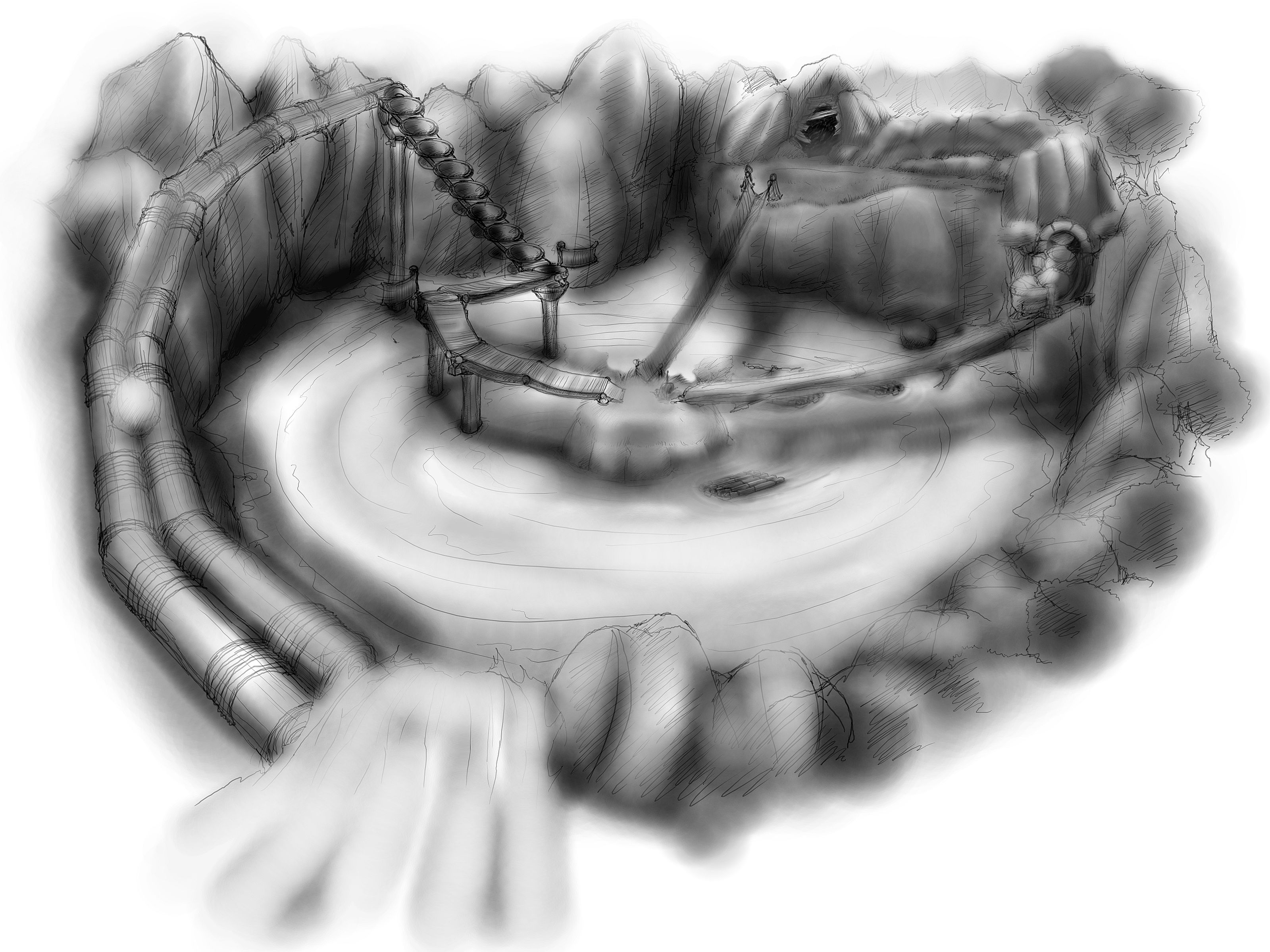
In the beginning the game designer (Darek) created a floor plan of the first test level containing some puzzles, jumping, fighting, collecting items. We want to make a prototype to test gameplay. Everything is described in our design document.
Beautiful.. isn’t it?
After this Qareeb made some concepts how it should look:
I realize that they are not as beautiful as my floorplan, but well… not bad 🙂


great artwork this games going to be great
cant wait to play it and learn from it. best of luck to the team 🙂
will the game models be the ones used for the peach movie just at a low poly count. or are you modeling everything from scratch.
That looks an awful lot like VagEYEnaman 😛
nate, i suppose they will use the peach models with some normal map goodness on them. I wonder about the fur though… Is there some realtime fur planned? there are some techniques that could work. for instance the shells and fins technique: layers of geometry with a alpha noise texture, plus contour fins. Maybe there are more advanced shader techniques too…
here’s a paper on it:
http://research.microsoft.com/~hoppe/fur.pdf
We’re planning on some real time nice fur, probably fins and shells, but we still have to see. We have already done quite some research. I put a list of references we’re considering now so people dont fill this with ones we already have :), if you have some other one dont hesitate to post it!
http://delcorp.org/~caedes/furpapers.txt
Actually, people from Peragro Tempus project offered to do the shader as they have quite some experience there.
“Experience” they call it, I wrote the one shader…
Looks like some great concept art — I like the feel of the initial layout! I’m really liking how things are starting to shape up, and the intentionality with which you are going about things. Keep up the great work, and thanks so much for the update!
Wow, very nice.
Can’t wait to see this in action.
Very cool! Please don’t forget to include this concepts inside the DVD.
Iam very curious about how “limits” will work inside level design. Is there any plans for culling sectors or what?
Thank you!
Man I am from brazil.So sorry for my english. I was looking for a program to make games and GCs in total 3D.
That art-works are so nice. Are you guys having any problems with Blender? I want to check out how Blender works… =P
neat! … I like the look of that very much! 🙂 Keep on with the planning etc and make a really GREAT game! 🙂
~epat. 🙂
I don’t know if you did that intentionally or not, but your concept level looks like a Vageyena Man.
http://www.thebestpageintheuniverse.net/c.cgi?u=vageyena_sightings
The levels look very good. I like the second one more than the first, however. The first level seems a little plain. Maybe with a few interesting enemies, activities it will become more interesting.
NathanKP – The Ink Weaver Collection – Writing Showcase Blog